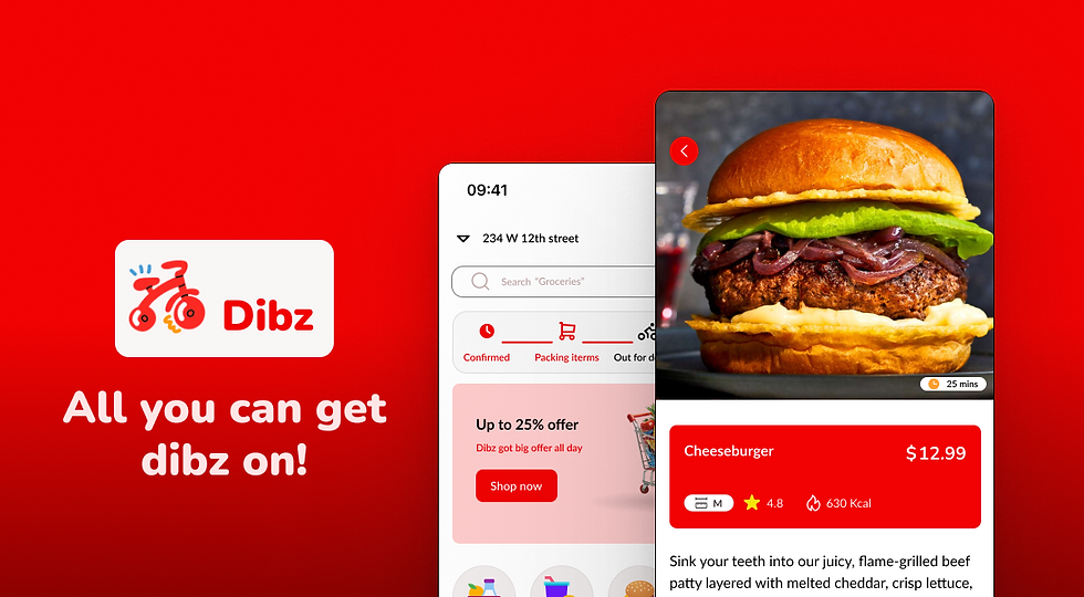
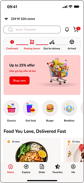
Dibz is a modern food delivery app built to give users more control, clarity, and confidence in their ordering experience.
Overview
Dibz is a modern food delivery app designed to give users more control, clarity, and confidence in their ordering experience
The Story
-
Problem Statement
Despite the convenience offered by most food delivery apps, users often face friction when it comes to discovering meals that fit their preferences, customizing portion sizes, and feeling confident about the delivery experience
-
Potential Solution
Dibz aims to bridge this gap by enabling users to, choose their own delivery driver for a more personal, trustworthy experience, see portion sizes that suit individuals, families, or events, also explore dishes through curated spotlights, nutritional info, and rich visuals, with user beigng able to navigate an intuitive, delight-driven interface that makes ordering food feel easy, exciting, and personal
-
Design Process
Research
Design
Test
Present
Research
The research phase started with a competitive analysis between two of the prominent food delivery apss out therer, which are Uber Eats and Door Dash. Understanding their strengths and weaknesses they face will guide me on breaking into this market
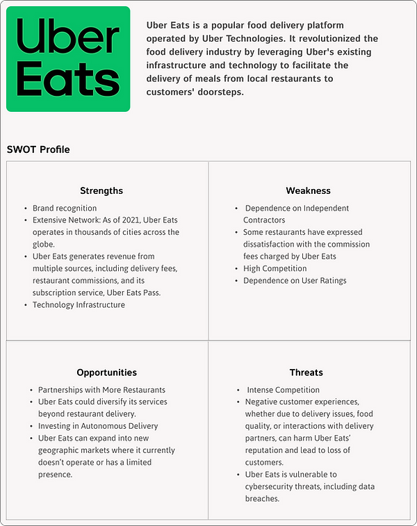

I recognize that the market is highly competitive, so I need to create a unique feature that sets Dibz apart from apps like Uber Eats and DoorDash. The next step will be to interview potential users and collect qualitative feedback to guide this project.
User Interview
In this section, I will explore the mindset of potential users to better understand the target audience for the app, including their needs, goals, and pain points. Let’s get started with the questions.
Questions asked
-
How often do you order food online?
-
How easy do you find most food delivery apps
-
What are some frustrating things you face while using a food delivery app
-
What’s one thing you wish your favorite food delivery app did better
-
What makes you try a new restaurant on the app?
-
Would you subscribe to a food delivery membership (like free delivery, exclusive deals)?
-
How do you usually search for food (filters, search bar, cuisine categories)?
-
What payment method do you prefer when ordering online?
4 participants were interviewed and they all gave insightful feedbacks
.png)
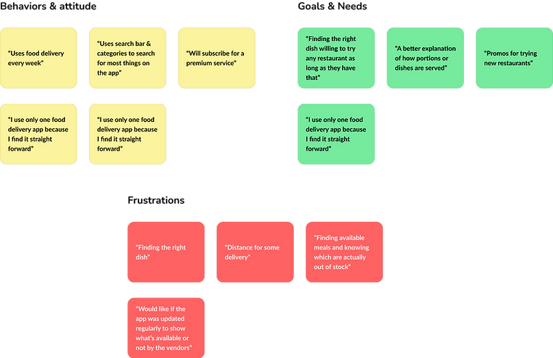
These were the feedback received from participants interviewed. With this information, I went ahead to create user personas for the Dibz app, outlining their goals, pain points, and behaviors.
Key findings
"Users want to trust who delivers their food ("wish I could pick the same driver again")"
"Nutritional info is often hidden or unclear."
"Families want flexible portion options without guessing serving sizes."
User Personas
.png)

Information architecture
Now that we had good feedback on what I needed to do, it was time to build the app's structure and user flow, aiming to create a good sitemap that would allow users to navigate the app easily.
I started with getting 5 participants to participate in an open card sorting experiment, and these were some of the results.


After seeing were people thought should be placed, it was time to create my sitemap for the Dibz app
Sitemap

Creating the sitemap was an easy process because of the card sorting that took pace prior. It was finally time for ideatio nd coming up with sketches, mid- fidelity prototypes, and high-fidelity prototypes
Low-fidelity prototype


Mid-fidelity prototype


High-fidelity prototype
.png)
I wanted the user interface to be easy to understand, so I included many features to give it the feel of a real food delivery app, as you would find in app stores. My goal was to encourage users to engage with and explore the app. With that said, I had to make use of variables linked with prototypes, which makes the UI feel more than just a mockup, but as an actual app
Testing
Tasks for this step include creating test cases and interviewing three participants using the questions listed below.
-
Navigate through the app and tell me how you feel about it
-
You’re hungry and want to order lunch. Start from the homepage and find a dish that looks appealing.
-
Add the dish to your cart and view your cart.
-
After selecting your meal and adding it to the cart, you want to choose who delivers your food. Try choosing your preferred driver from the available options.”
-
Proceed to checkout and place the order.”Explore the app and share your thoughts on it.
I also thought about post task interview question I will ask the participants, to get more feedback
-
What did you find easy or enjoyable about the experience?
-
What was frustrating or confusing?
-
Was anything missing that you expected to find?
-
How likely are you to use an app like this in real life?
Testing itself was done relatively quickly. I dedicated one day each to each participant. It took about three days to finish the interview process, then the test evaluation began the following day
Test evaluation
Here’s a breakdown of my results.

The biggest pain point seemed to be fewer details for the products ordered. Two of the users didn’t immediately find out where the feature "Choose a driver" was, saying it needs to be more prominent.
One of the Interview users got frustrated when she wasn't able to go back after placing an order, she said she normally used to being able to go back even while the delivery is in progress, she doesn't have to wait before a delivery is finish before she can get something else, which is totally understandable since it is something we usually see in food delivery apps.
Redesign
Based on these insights, I slightly redesigned the app and added a card page for the products to get more information about what you are ordering.
.png)
Before
.png)
After
The "Choose a driver" feature is now more prominent, so users don't miss it. Also, now you can see which driver was selected during checkout. Before, the "Choose a driver" feature would be missed because it blended in with the other details of the checkout section, but after the redesign, now it's the first thing you would see.
.png)
Before
.png)
After
.png)
Added indicators of which drivers was chosen when the feature has been used
In the redesigned version, there is now a cancel button that allows you to go back while the delivery animation is in progress. Additionally, I’ve added a progress indicator on the homepage, which provides a minimal view of the delivery status. You can also click on the indicator to see the delivery animation.
Before
.png)
After
.png)
You can still track the delivery on the home screen