NicheClick
A showcase of the NicheClick that brings about a hub where users can find their niche interests and create communities

Overview
A showcase of a niche app where people can join a community, interact with specific niche community tools, and share what's on their minds
The Story
-
Problem Statement
"Users need a way to use the app to find specific niche communities with tools, with less jargon that makes the app difficult to use"
We all need that space where you can find people with similar interests, talk about challenges you all face, share solutions, and share ideas. Well, that's the reason I embarked on the project: to build communities where people with different niche interests come together.
-
Potential Solution
Create a mobile app that brings people with different niche needs together, to be able to create communities, use specific niche tools and share what's on their mind, with making the whole navigation process easy and under as possible
-
Design Process
Research
Design
Test
Present
Research
First, I started by doing some competitive analysis on similar apps to get an idea of I should aim and what to avoid while creating my Niche


From the competitive analysis, I can see some weaknesses similar apps face: clustered interface, navigation that takes time for users to get used to, and lack of customization. As for threats I will be facing intense competition, which means I have make this app stand out with certain features
User Interview
After competitive analysis was conducted, it was now time to recruit some participants and conduct a user interview, to gain some insights from users before starting the project. The interview questions can be found below
Questions asked
-
Have you ever used any niche apps before?
-
How do you feel about an app where you can find different niches for example apps like Reddit
-
What challenges have you come across when using a niche app
-
How could niche apps better support your specific needs or preferences?
-
Do you feel the need to use multiple apps to meet your niche needs? Why?
-
What specific tools or features do you find most useful in niche apps?
-
How easy or difficult can you start using a new app or platform?
-
Have you ever felt overwhelmed by the onboarding process in a niche app?
Empathy Map
When analyzing data from the interview, I narrowed the findings into manageable reference points. This helped me understand what future users may encounter while using the NicheClick app
Doing

Goals & Needs

Thinking & Feeling

Pains & Frustrations

User Persona
After getting feedback from the participants and then using affinity mapping to make sense of the data collected, I brought to life their data by creating a user persona, highlighting some of the pains users face when using a niche app.

User flow
Next, I made a user flow as a guide to craft out my sketches (low-fidelity prototype)

Sketches


After the sketches were made, I conducted a minor usability test with 2 participants to see how they interacted with the low-fidelity prototype. I did this to create a well-thought-out "sitemap" for the app.
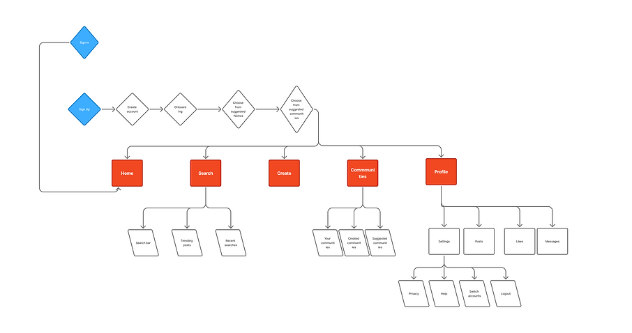
Site Map
The feedback from the sketch was very useful in creating a sitemap that will appeal to users and make navigation across the app simple and straightforward
Interaction Design
After researching and analyzing design patterns that aligned with the information architecture, business goals, and user needs, I began sketching out solutions. Using rapid prototyping and Marvel, I quickly brought ideas to life, refining them through an iterative process. Throughout, I stayed focused on addressing our "How Might We" questions while ensuring the design met both WCAG 2.0 accessibility standards and Apple’s Human Interface Guidelines.
Mid-fidelity prototype
In this project coming up with the low fidelity prototype wasn't as hard, because in other projects its always the most difficult for me, but in this it came more naturally


Branding

App logo
UI Kit


Testing
After the high-fidelity prototype was finalized, a Usability Test Guide was written and proposed. Participants from different walks of life were then recruited to take part in a Zoom virtual usability test.
Five usability tests using the hi-fidelity prototype of the NicheClick App were conducted.
Six tasks were created to test the usability and critical objectives of the feature, including assessing the ease of the onboarding process, creating a community, sharing a post, and interacting with the app in general.
Summary of Feedback
"It is familiar in the sense that, you do not need to entirely learn how to use the app"
"Icons are really thin and too much on the navigation bar"
"Icons are really thin and too much on the navigation bar"
Of the six tasks, all task flows were completed sufficiently and with expediency by all participants. All participants were impressed with the visual design, how straightforward it was, and how familiar and different the app felt at the same time. Each participant mentioned their needs, feedback, and suggestions. In which I created an affinity map to gather all the feedback and implement them in the next step
Affinity Map
An Affinity Map was created to help illustrate the wins, frustrations, pains, and next steps for the next iteration of NicheClick. These included direct quotes from participants and allowed the features and flows to be analyzed more deeply.

Affinity Map
After the influx of feedback from the participants, I needed to judge the severity of each feedback. As to focus on the important ones that need immediate attention and some that are cosmetic errors that can be easily fixed. I used the scale below to judge the severity level:
-
0 = 1 don't agree that this is a usability problem at all.
-
1 = Cosmetic problem only: need not be fixed unless extra time is available on the project.
-
2 = Minor usability problem: fixing this should be given low priority.
-
3= Major usability problems: important to fix and should be given high priority.
-
4 = Usability catastrophe: imperative to fix before the product can be released.
